
The product
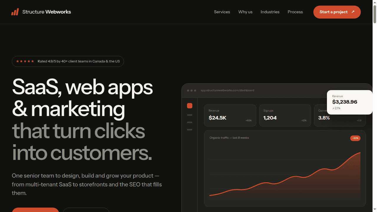
Independent concept study
An independent front-end study built from a public reference. It was not commissioned by, and is not affiliated with, the reference brand.
Who uses it
Prospective buyers comparing an agency's services, delivery model and proof before making contact.
- Before
- The local recreation stopped after the opening section, with placeholder links, no complete mobile flow and no durable route on the PSOI Tech site.
- After
- A complete responsive study now carries the design language through services, process, proof and contact sections, with an isolated live demo and explicit attribution.
The problem
The study began with a publicly visible marketing site and an incomplete local recreation containing only the hero and part of the services section.
A useful front-end study has to do more than imitate one screenshot. It has to reconstruct the page's hierarchy, responsive behaviour and interaction patterns while keeping the reference brand, its claims and PSOI Tech's role unambiguous.
What PSOI Tech delivered
- Complete responsive homepage from hero through final call to action
- CSS-built dashboard, service and workflow illustrations with no stock imagery
- Mobile navigation, keyboard focus states and reduced-motion support
- Isolated static demo route so the study cannot leak styles into the PSOI Tech site
Decisions that shaped it
- 01
The demo is isolated from the PSOI Tech application
The study ships as a self-contained static document with its own stylesheet, script and font asset. That preserves the reference-led visual system without allowing its global selectors to change the PSOI Tech navigation, routes or components.
- 02
The relationship is stated before the design is judged
A persistent disclosure names the work as an independent front-end study and links back to this case-study page. The work index lists it in a separate concept section rather than beside client engagements.
- 03
Interface visuals are built, not borrowed
Dashboard charts, cards, calendars and process diagrams are recreated with semantic HTML, CSS and inline SVG instead of copied screenshots or unlicensed photography, keeping the study inspectable and responsive.
- 04
Mobile behaviour is treated as part of the build
The layout collapses deliberately at phone widths, the header call to action yields to one mobile menu, touch targets stay at least 44 pixels high and fixed-header anchors retain a visible offset.
Where it stands
A complete, navigable front-end study published separately from client work, with desktop and mobile previews and a live self-contained demo.
No performance figures are published for this build. This entry documents an interface study, not a client engagement, so it makes no commercial or client outcome claim.
Stack
More screens